Mercedes-BenzUX research · Interaction design · Connected experiences
Designing continuity across connected experiences.
A comparative UX study of how interaction models should carry over between in-vehicle systems and personal devices.
- Organization
- Mercedes-Benz AG, Sindelfingen
- Project
- MBUX companion app — master’s thesis research
- Period
- Aug 2018 – Apr 2019
- Role
- Master’s thesis, User Experience
- Worked with
- The Mercedes-Benz UX Design & HMI team
- Methods
- Comparative evaluation · Task-based testing · Behavioural observation · Interactive prototyping

Interfaces and scenes on this page are re-created for publication. The research material stays with Mercedes-Benz.
At a glance
- The question
- Should familiarity come from the platform — iOS and Android conventions — or from the product, the logic people already know from MBUX?
- The approach
- Stop debating. Build both interaction models, put them in front of 32 people on smartphones and tablets, and observe behaviour rather than ask for preference.
- The outcome
- On smartphones, 75% of interaction patterns favoured the MBUX-adapted model — a research-based direction for the companion experience.
Who did what
An independent study — my master’s thesis, in collaboration with Mercedes-Benz and its UX Design & HMI team. I defined the question, designed both concepts and their prototypes, designed and ran the study, and wrote the recommendation. No stakeholder owned either concept, which is part of why the answer held.
01Context
One product experience. Multiple interfaces.
A vehicle experience now extends beyond the built-in displays. Passengers adjust comfort from a rear-seat screen, then reach for a companion app on their own phone or tablet. Each device has its own conventions, capabilities and ergonomics — but people may well understand them as parts of one product.
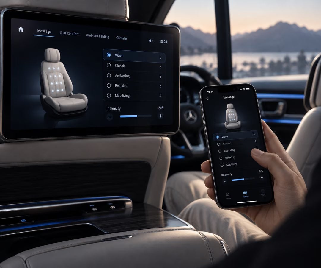
Most mobile apps follow the conventions of iOS or Android, which usually reduces friction. A companion app has a different role. Following platform conventions could make it feel familiar as a phone app — while forcing people to relearn interactions they already understood in the vehicle.
02Research question
Where does familiarity come from?
Two competing approaches were both plausible, and each rested on an assumption that could be tested:
Platform-first
Follow established mobile conventions. The assumption: familiar smartphone interactions reduce cognitive effort.
Product-first
Adapt MBUX’s interaction principles to mobile. The assumption: what people learned in the vehicle transfers to the companion app.
Neither could be chosen with confidence on visual preference alone. The decision needed research.
03My role
From research question to evaluated interaction concepts.
The study was my master’s thesis, carried out in collaboration with Mercedes-Benz’s UX Design & HMI team. I was responsible for:
- Defining the research question.
- Designing the two competing interaction concepts.
- Building the interactive prototypes.
- Designing the evaluation and running every session.
- Interpreting the findings and turning them into design recommendations.
04Methodology
Comparing behaviour rather than asking for preference.
Thirty-two participants completed the same comfort-related tasks with both concepts, on smartphones and on tablets. Instead of asking which interface they liked better, the study observed how they behaved: how confidently they completed the tasks, whether they could predict how the system would respond, and how easily knowledge carried over between devices.
- Participants
- 32
- Interaction concepts, same functionality
- 2
- Device classes — smartphone and tablet
- 2
Both concepts covered the same functionality, so differences in behaviour could be attributed to the interaction model rather than to the task.
05The two concepts
Platform familiarity versus product continuity.
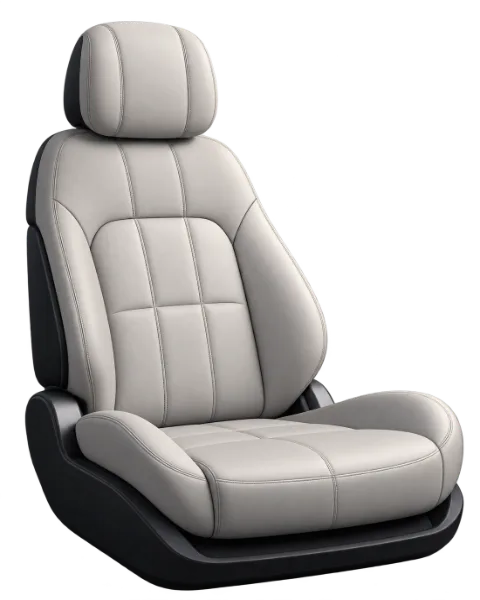
The platform-first concept used established mobile patterns: a navigation bar, a grouped list, a checkmark for the selection. The product-first concept carried the logic of MBUX into the phone: the seat as the anchor, programmes as tabs, the vehicle’s own vocabulary. Same screen, same task, two answers.
Pick a massage programme, then switch concepts — your selection carries over.
06Findings
Familiarity with the product mattered.
Participants didn’t treat the companion app as a separate mobile application. Rather than relying on smartphone conventions, they reused the interaction principles they had learned in MBUX.
Switch between smartphone and tablet.
The tablet result matters as much as the headline. With more screen space the advantage narrowed — device size changes how people read an interface’s structure. The insight isn’t that mobile conventions should be ignored. It’s that continuity with the product can be worth more than consistency with the surrounding platform, especially on the device that is furthest from the vehicle’s own screen.
07Recommendation
Preserve the mental model, adapt the interface.
A phone shouldn’t simply reproduce an in-vehicle interface. Different devices need different layouts, navigation and ergonomics. But the underlying interaction logic can stay the same. The recommendation was to keep MBUX’s familiar principles and adapt how they are implemented to the constraints of each device — so nobody has to learn the product twice.
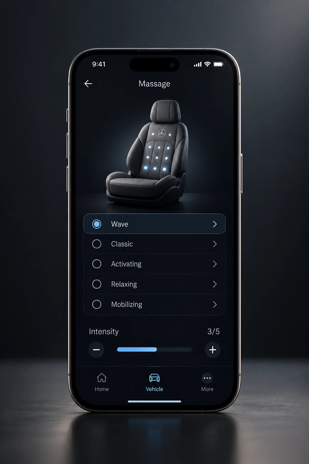
Choose a programme on the vehicle screen, then play the handoff to the phone.
08Outcomes
Evidence replaced an unresolved design debate.
- A research-based direction for the companion experience, grounded in observed behaviour rather than design opinion.
- A demonstration of how two credible interaction concepts can be settled by testing them side by side.
- A broader principle for connected products: continuity depends on preserving how people understand the product, not on making every interface look identical.
- Concepts tested head to head
- 2
- Participants in the study
- 32
- Of smartphone interaction patterns favoured the MBUX-adapted model
- 75%
09Reflection
Consistency is cognitive before it is visual.
This project taught me to test design assumptions rather than argue them. Two approaches can both look reasonable; research shows how people actually read and use them. The goal was never to prove that one design looks better, but to understand which interaction model helps people complete their tasks.
Continuity lives in the mental model people carry from one screen to the next. Protect that, and the interface is free to change.