Preserving continuity across devices.
Passengers move between the vehicle’s built-in displays and their own smartphone, adjusting comfort from the rear-seat screen, then reaching for a companion app on their phone. The device changes. The product does not.
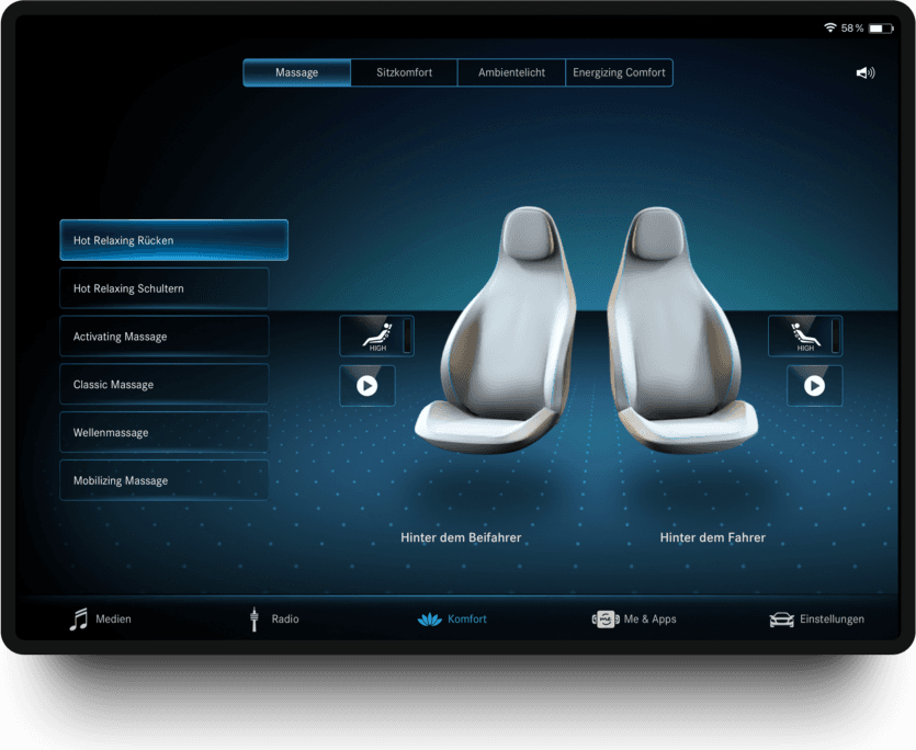
The question wasn’t how to design another mobile app.
Most mobile applications follow the conventions of iOS or Android. That usually reduces friction, since users already understand their device. But companion apps occupy a different role. Passengers don’t experience them as independent products.
They move between the vehicle interface and the smartphone as part of one continuous experience. Following platform conventions could make the app feel familiar as a mobile application, while forcing users to relearn interactions they already understood inside the vehicle.
Should familiarity come from the platform, or from the product itself?
Two ways to create familiarity, turned into a testable hypothesis.
Rather than debating design preferences, I built two interaction concepts. The objective wasn’t to compare visual designs. It was to understand which interaction model people naturally relied on.
The interface followed established mobile interaction patterns.
The assumption: familiar mobile conventions reduce cognitive effort.
Native list rows and switches, familiar as a phone app, disconnected from the car.
The interface translated the interaction principles of MBUX to mobile.
The assumption: knowledge acquired inside the vehicle transfers across devices.
The car’s seat visualisation, palette and motion, so the phone reads as an extension of the vehicle.
Studying behaviour, not preference.
Thirty-two participants completed identical comfort-related tasks using both concepts, across smartphones and tablets. Instead of asking which interface they liked better, the study observed how they actually behaved.
- 01How confidently they completed tasks
- 02Whether they could predict system behaviour
- 03How easily previous knowledge transferred between devices
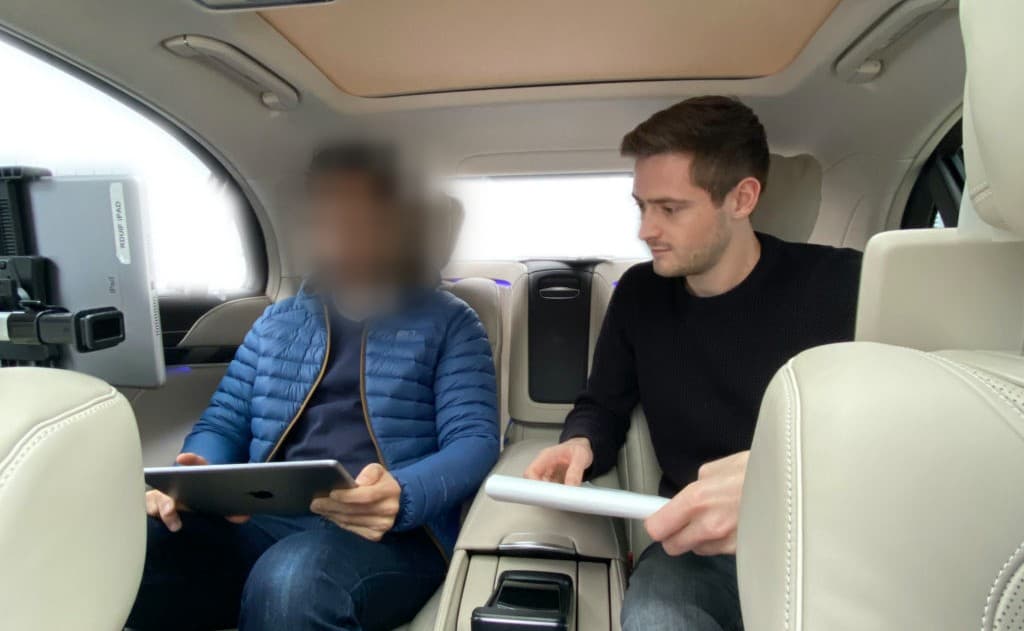
On smartphones, 75% of interaction patterns favoured the product-first (MBUX-adapted) model. On the smaller screen, passengers reused what they already knew from the vehicle.
Participants treated the app as a continuation of the vehicle.
They didn’t approach the companion app as a separate mobile application. Rather than relying on familiar smartphone conventions, they naturally reused the interaction principles they had already learned inside MBUX.
The most valuable finding wasn’t about interface design. It was about continuity. When people move between touchpoints of the same product, they expect their knowledge to move with them.
Consistency isn’t primarily visual. It’s cognitive.
Not recreating the interface, preserving the logic.
Phones require different layouts, navigation patterns and ergonomics. The interaction language of MBUX was translated to fit the constraints of mobile, while preserving the logic users already understood. The interface adapted to the device without asking users to learn the product twice.
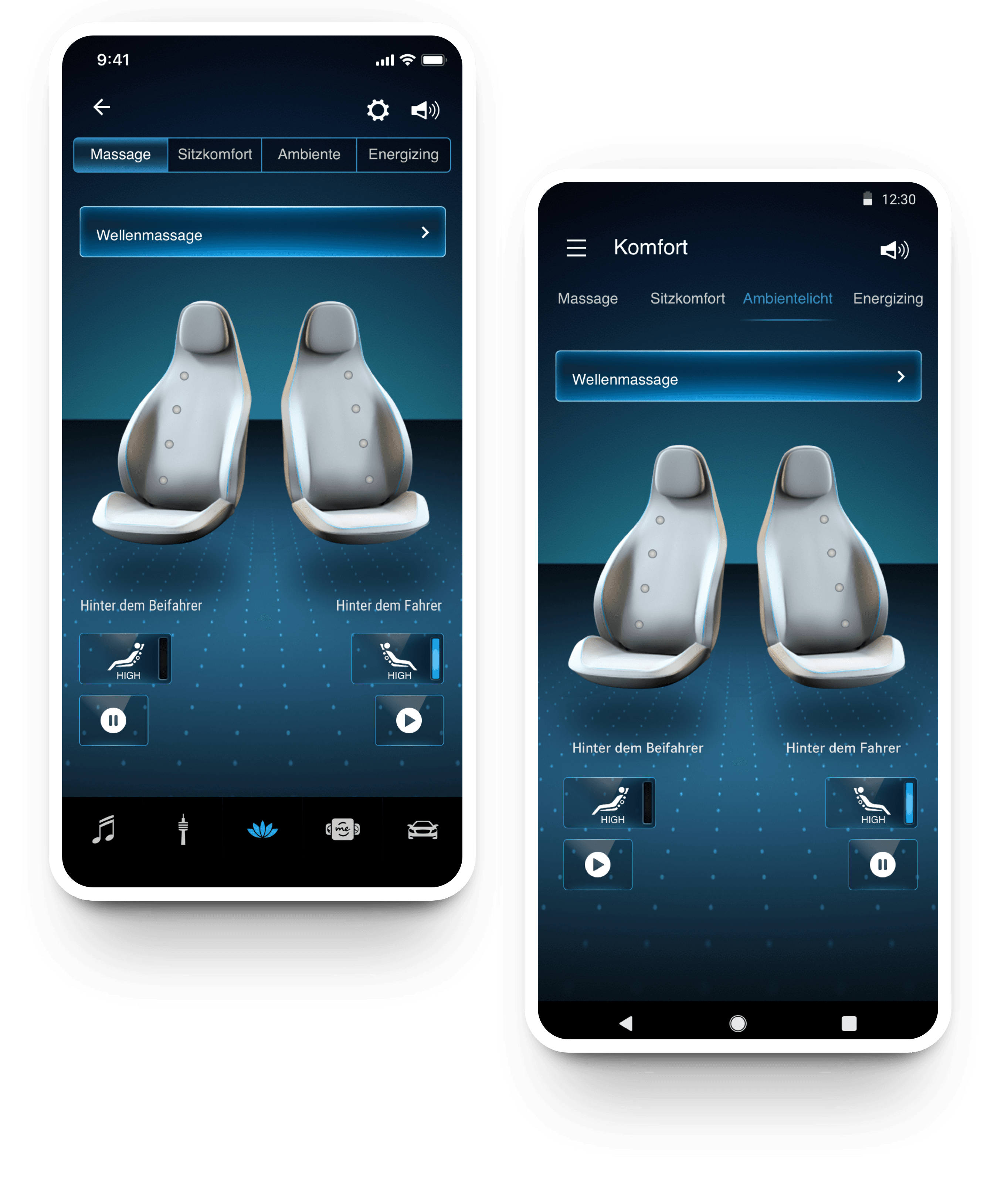
Behaviour, not preference, set the direction.
Watching how people actually worked replaced a design debate with a measured answer, and gave the team a clearer way to build the companion app.
- A companion-app direction chosen from evidence, not design opinion.
- A mobile design language that carries MBUX logic to iOS and Android.
- A continuity approach the HMI team can reuse beyond this screen.
I used to think continuity meant making every screen look and work the same.
It doesn’t. Continuity lives in the mental model people carry from one screen to the next. Protect that, and the interface is free to change.